Referral reward: 10% off for you when a friend books a project. Your website glow-up starts here

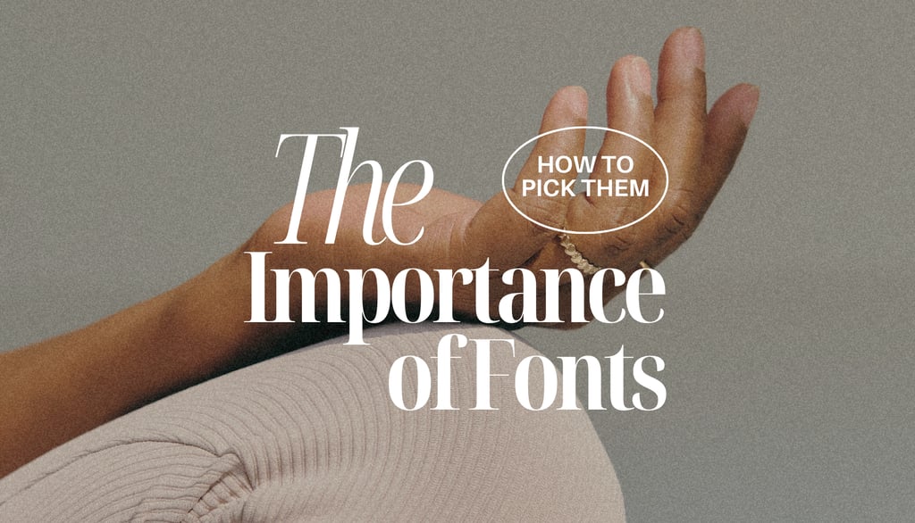
Fonts: The Silent Designers of Your Website
When people land on your website, they don’t read first — they feel. Before a single word is processed, your fonts are already doing the talking. Typography is one of the most underestimated elements of web design, yet it quietly influences how users perceive your brand, how long they stay, and whether they trust you enough to click, scroll, or buy. Let’s break down why fonts matter so much — and how to use them intentionally.
Why Fonts Are More Powerful Than You Think
Fonts create first impressions (fast)
It takes users just milliseconds to form an opinion about a website. Fonts play a huge role in that snap judgment. Clean, balanced typography feels trustworthy and professional. Poor font choices? They can make even great content feel chaotic or outdated.
Typography communicates personality
Fonts carry emotion.
A serif font can feel editorial or luxurious.
A rounded sans-serif might feel friendly and modern.
A bold display font can feel confident, expressive, or rebellious.
Your typography should reflect who you are before users even read your “About” page.
Good fonts build trust
When typography is inconsistent, hard to read, or poorly spaced, users subconsciously lose confidence. Clear, thoughtful typography signals credibility and care — two things every brand wants to communicate.
Fonts guide the eye
Typography isn’t just about looks — it’s about direction. Fonts help users understand what’s important, what to read first, and what can be skimmed. Without clear hierarchy, everything feels equally loud… and users disengage.
Typography affects accessibility
Readability matters. Font size, contrast, spacing, and weight all impact how inclusive your website is. Good typography makes content easier to consume for everyone — across devices, ages, and abilities.
How to Use Fonts Well on Your Website:
Keep your font selection simple
More fonts don’t equal better design. In fact, the opposite is usually true. Most websites work best with one primary typeface and one supporting font. This keeps your design cohesive and intentional.
Build a clear hierarchy
Headlines, subheadings, body text, captions, buttons — each should have a clear visual role. Use size, weight, and spacing to create structure instead of relying only on color or layout.
Pair fonts thoughtfully
The best font pairings create contrast without fighting for attention. A character-driven font works beautifully for headlines when balanced with a neutral, highly readable font for body text.
Don’t sacrifice readability for trends
Trendy fonts can be tempting, but if users struggle to read your content, they won’t stay. Always test fonts on different screen sizes and prioritize clarity over novelty.
Give your text room to breathe
Spacing is just as important as the font itself. Generous line height and margins make content feel lighter, calmer, and easier to scan — especially on mobile.
Design for mobile first
A font that looks stunning on desktop can fall apart on small screens. Always check how your typography scales, wraps, and reads on mobile before committing.
Stay consistent
Typography systems work when rules are respected. Consistency across pages creates a sense of flow and professionalism — and helps users feel oriented as they navigate.
The Best Typography Is Almost Invisible
When typography is done well, users don’t notice it — they just feel comfortable. They scroll more. They read more. They trust more.
Fonts aren’t decoration. They’re a strategic design tool that shapes how your website is experienced, remembered, and understood.
So next time you’re choosing a font, ask yourself:
What do I want people to feel before they even read a word?
Because chances are — your fonts are already answering that question.